
Graphic Design
Graphic design in Portsmouth that's built to sell, not just look good.
Logo, brand, print and digital design for Portsmouth and Hampshire businesses — sixteen years of design led by marketing, from one experienced designer who does the work herself.
The trouble with design for most Hampshire businesses
You know good design matters — it's the first thing a customer sees, and it decides in seconds whether you look like a business worth trusting. The trouble is getting design that actually does a job, not just decoration.
So most businesses end up in one of two places. Either the design is a mishmash — a logo from years ago, a brochure from someone else, social posts cobbled together — with nothing quite matching. Or they hire an agency and find themselves passed to a junior, paying agency prices for design that looks fine but doesn't move the needle.
And the agencies all sound the same: "results-driven creative", "strategy-led visual storytelling", a team of specialists you’ll never actually meet.
Design doesn't need to be treated as a surface-level upgrade. It needs a clear purpose, a consistent look, and someone who understands that good design is really a marketing job — turning first impressions into customers across Portsmouth, Hampshire and beyond.
The approach
Design led by marketing, not decoration
Good design starts with a purpose, not a pretty picture.
Before I design anything, I work out what it needs to achieve and who it's for — because I approach every design job as a marketing problem first. The design follows the strategy, so your logo, brand and materials don't just look good; they communicate the right message to the right people and help win you business.
That's the difference between design that fills space and design that actually works for you.
What's included
A complete graphic design service
From a single logo to a full brand rollout — and every file you receive is production-ready and yours to keep.
Logo and brand identity
Memorable logos and full brand systems that reflect who you are.
Brand guidelines
Colours, fonts and rules that keep you consistent everywhere.
Print design
Brochures, flyers, posters, packaging and signage, print-ready and production-managed.
Business and office stationery
Business cards, letterheads and modern stationery that look the part.
Digital and social graphics
Social content, digital ads and web visuals that perform online.
Illustration and bespoke assets
Custom illustration, icons and artwork unique to your brand.
Exhibition and event design
Stands, banners and event collateral that get you noticed.
Merchandise and apparel
Branded products, packaging and clothing designs.
The process
How I work — a clear, proven process
| 1 |
Deep Dive |
I get to know your business, your market and your customers, and agree exactly what the design needs to achieve. |
| 2 |
Concept |
I develop ideas and directions, so you have real options to choose from, never a single take-it-or-leave-it. |
| 3 |
Design |
I craft the chosen direction into polished, on-brand artwork. |
| 4 |
Refine |
I fine-tune it with you until it's exactly right — no precious egos, just better design. |
| 5 |
Deliver |
I hand over production-ready files for every use, from print to web to social. |
Ways to work together
Delivery that fits your business
Not every business needs the same level of support, so there are three straightforward ways to work together:
Ongoing design support
I become your go-to designer across all your marketing, month to month.
Project by project
A logo, a brand, a brochure — designed as a one-off when you need it.
Brand audit and guidelines
I review what you have and give you a consistent system your team can use.
Pricing
Simple, transparent pricing
Graphic design works two ways: as part of your monthly marketing, or as a standalone service — whichever suits your business best.
As a standalone service, I price per project or per day — a logo, a brand identity, a set of stationery — and you'll always get a clear quote before any work begins, with my day rate published on the website. No long contracts, no hidden fees, and you own every file at the end.
a day — or a clear per-project quote
Design that works with the rest of your marketing
Design works hardest when it's not created in isolation. A great logo that doesn't carry through to your website, or social graphics that don't match your brochure, only tell half the story.
I create yours as one part of a single plan. Your website, your social media and your email all share one consistent look and message — so your brand feels joined-up everywhere a customer sees it, and every design decision reinforces the rest.
I'm based in Portsmouth and work with businesses across Hampshire and the South Coast — Southampton, Fareham, Gosport, Havant, Chichester and beyond. Working with a local designer means you get someone who understands your market, who you can sit down with to get things right, and who handles your design personally — not a faceless agency queue.
Results
Real results, for real businesses
Sixteen years and hundreds of projects — here's a taste:
Windracers |
Created the full brand identity from scratch: brand guidelines, exhibition stands, product brochures and UAV wraps used across the UK, United States and Norway. |
International language school |
Brand and campaign design that helped grow new student sign-ups 30%. |
Portsmouth Seafood Festival |
Event branding and design behind an 82% increase in footfall to Gunwharf Quays. |
Across it all |
Logos, packaging, stationery, apparel, magazines and exhibition design for businesses in Hampshire, the UK and beyond. |
Selected work
Logos, brands and print
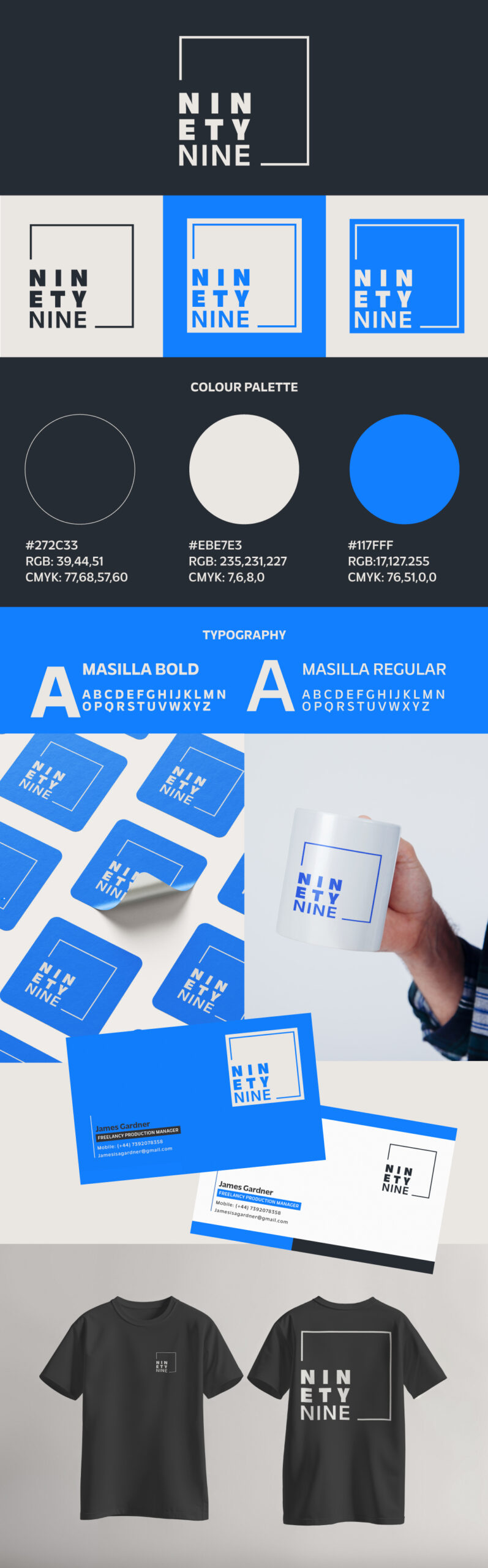
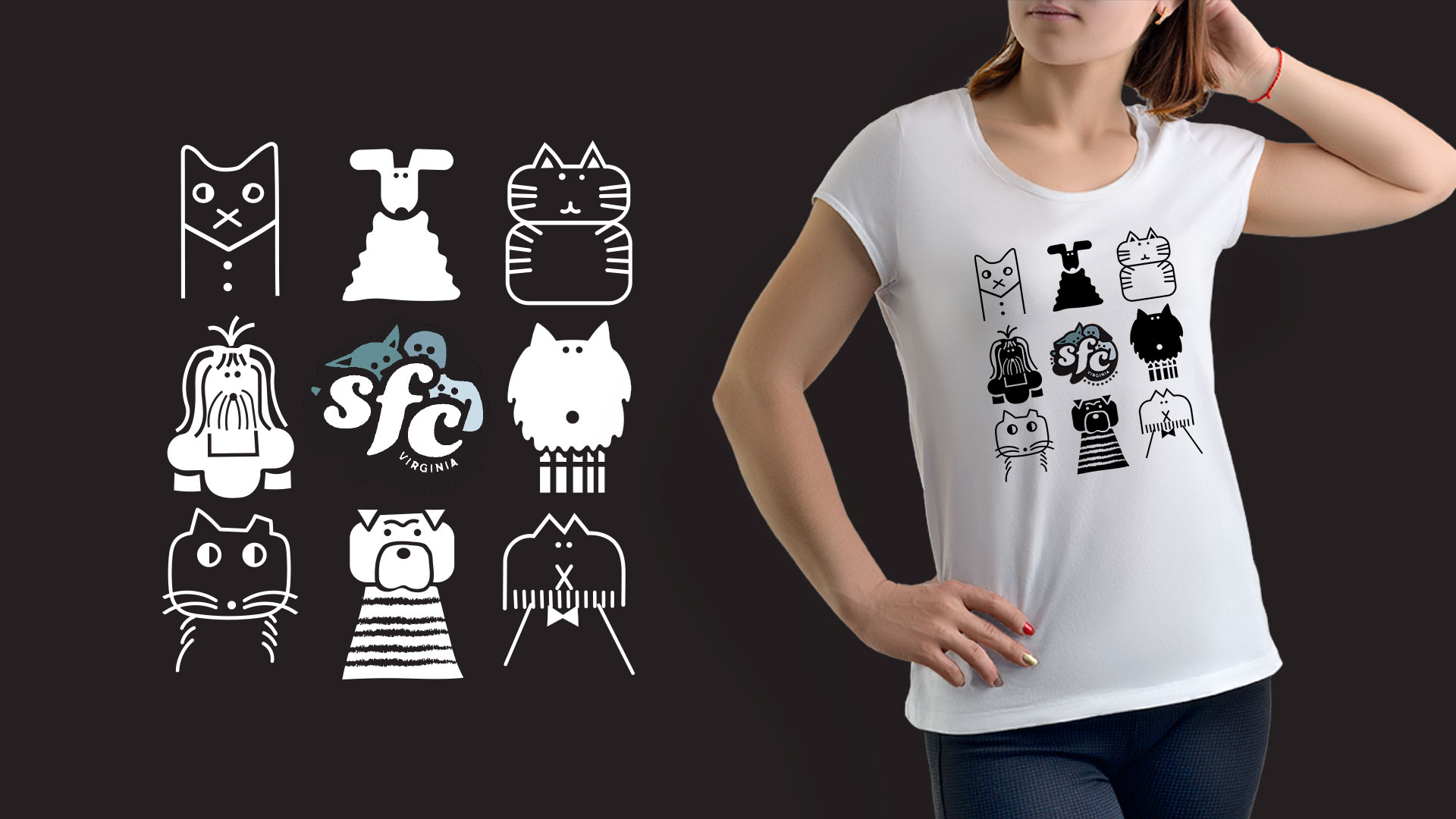
A selection from recent projects. For the full story behind the bigger campaigns, see the case studies.
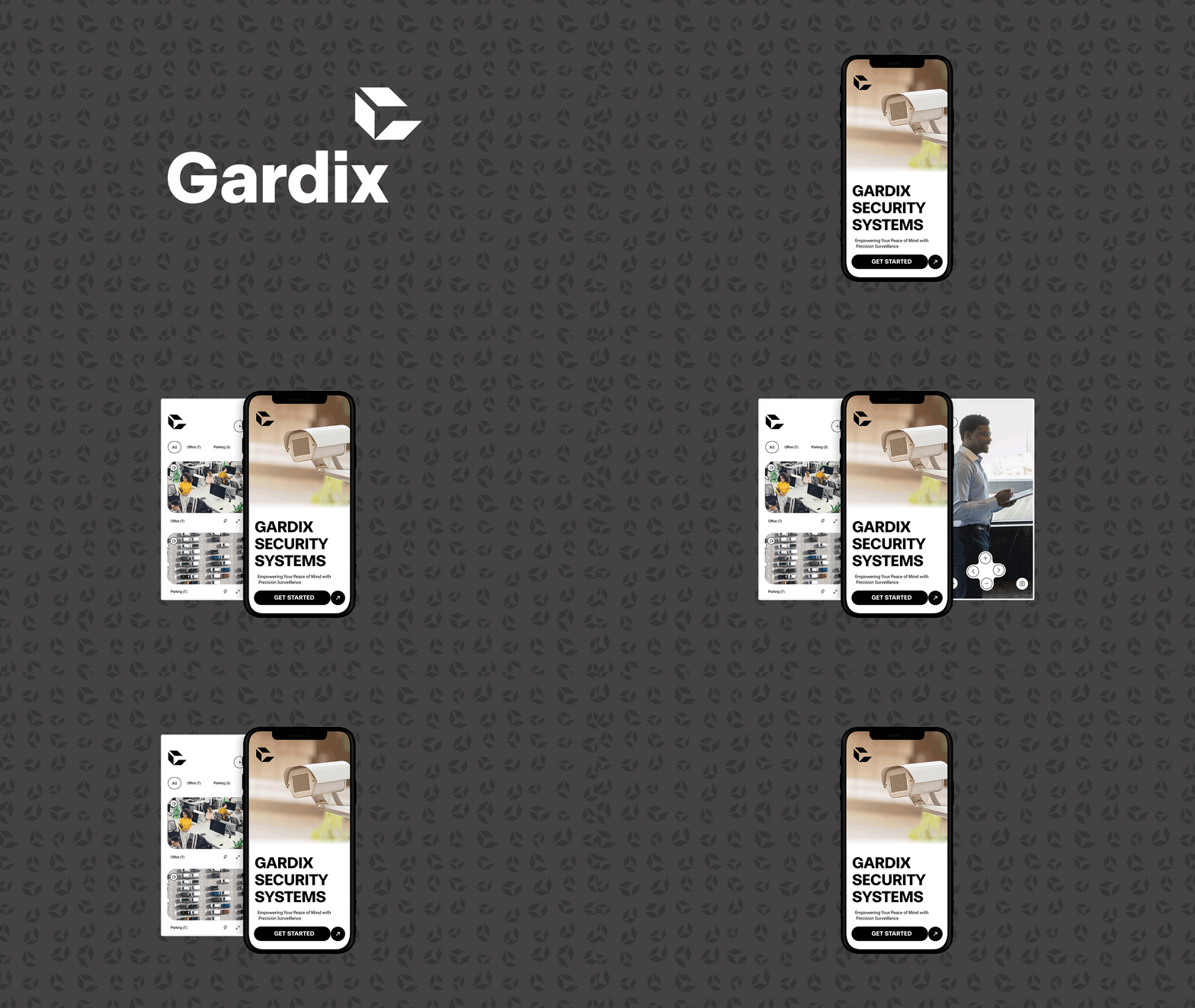
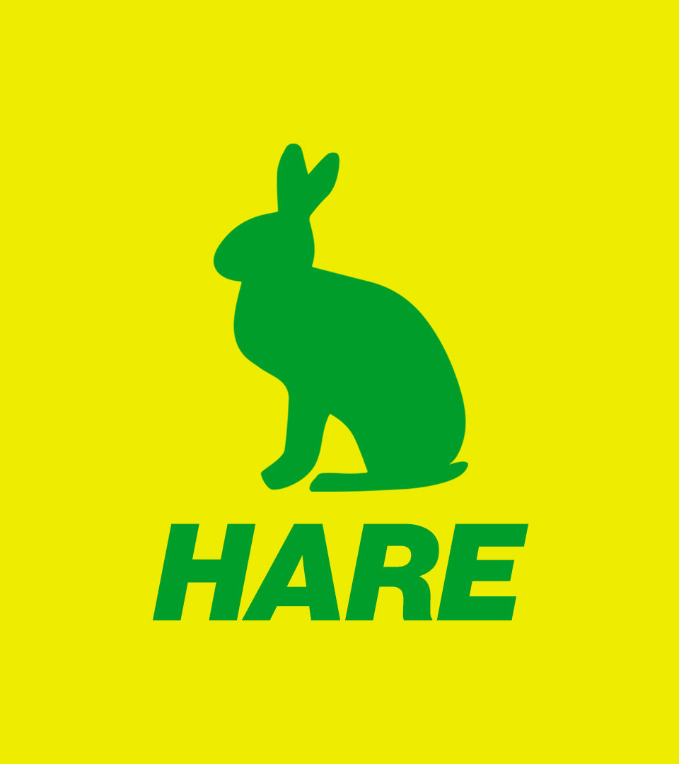
Logos & brand identity
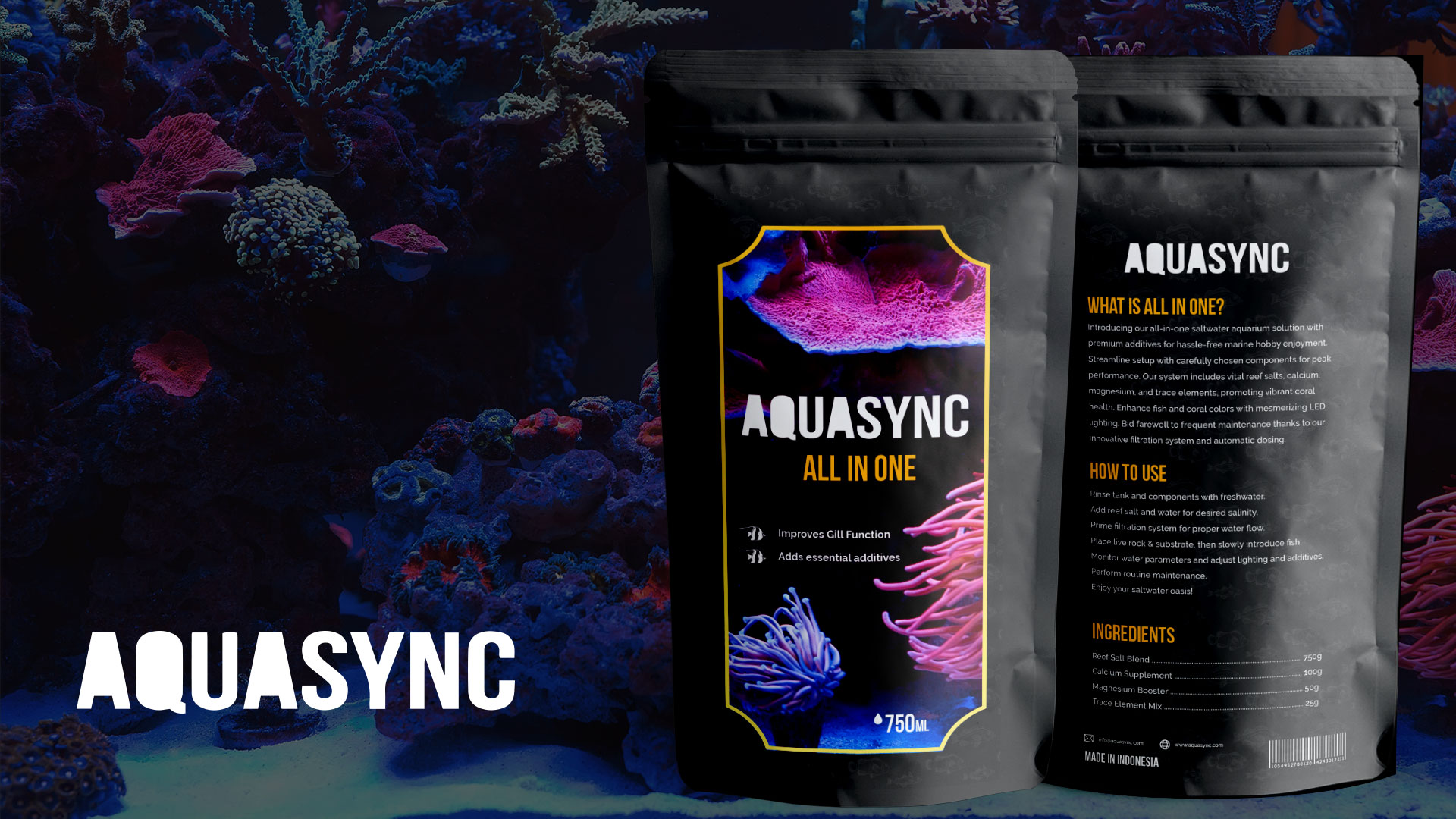
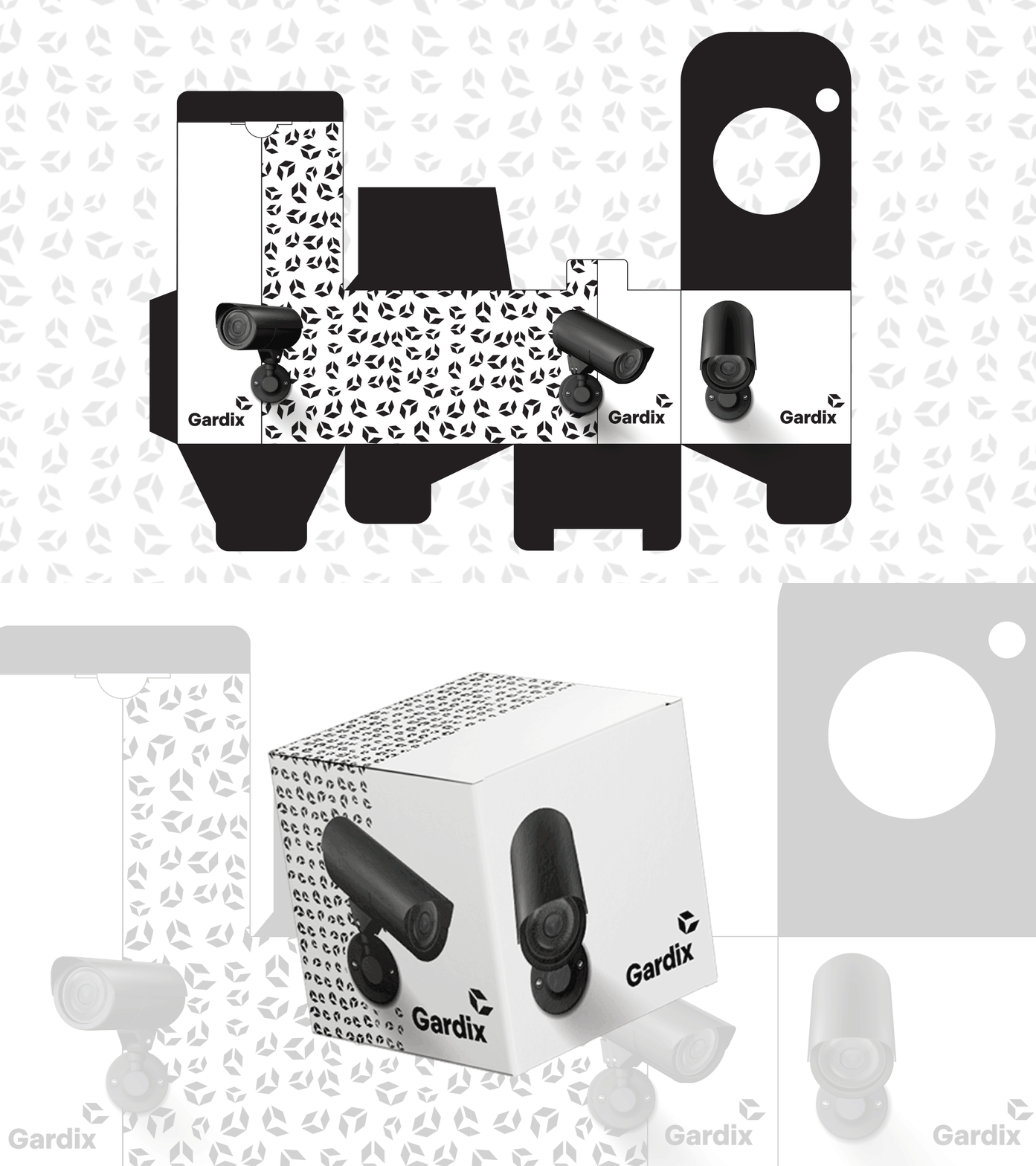
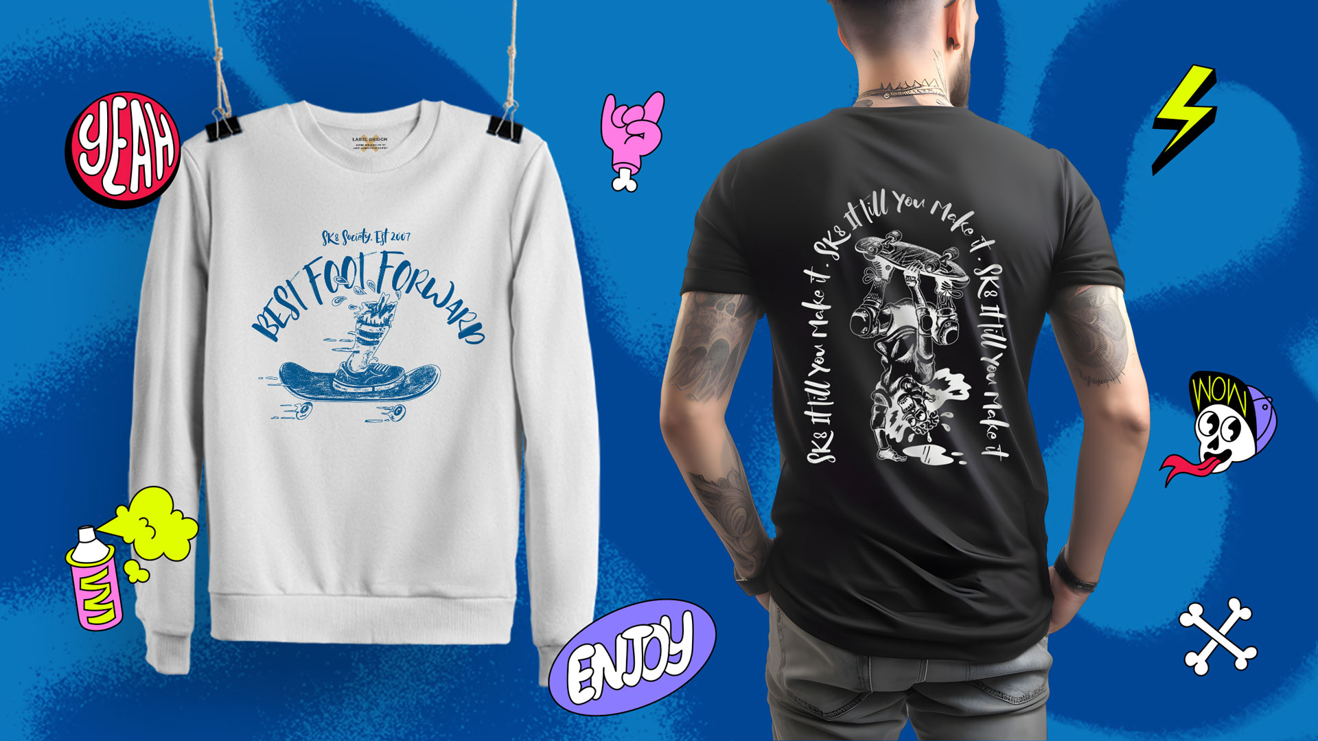


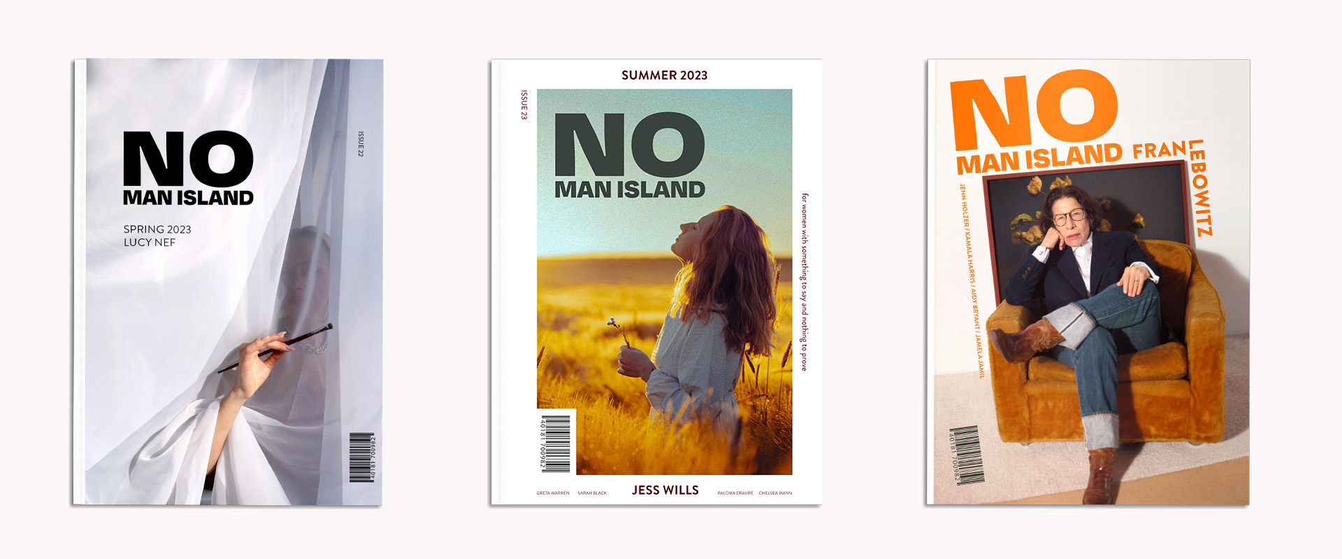
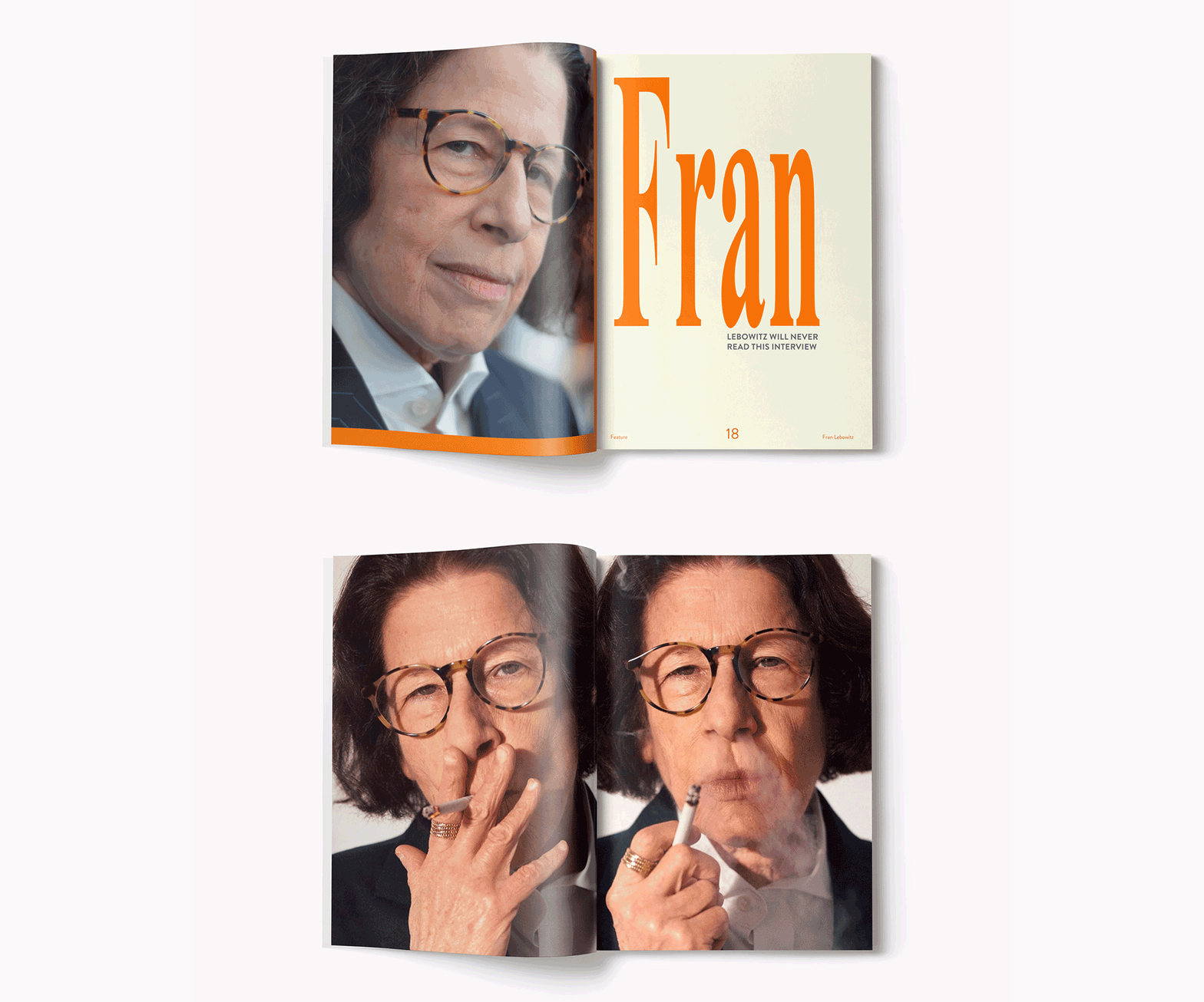
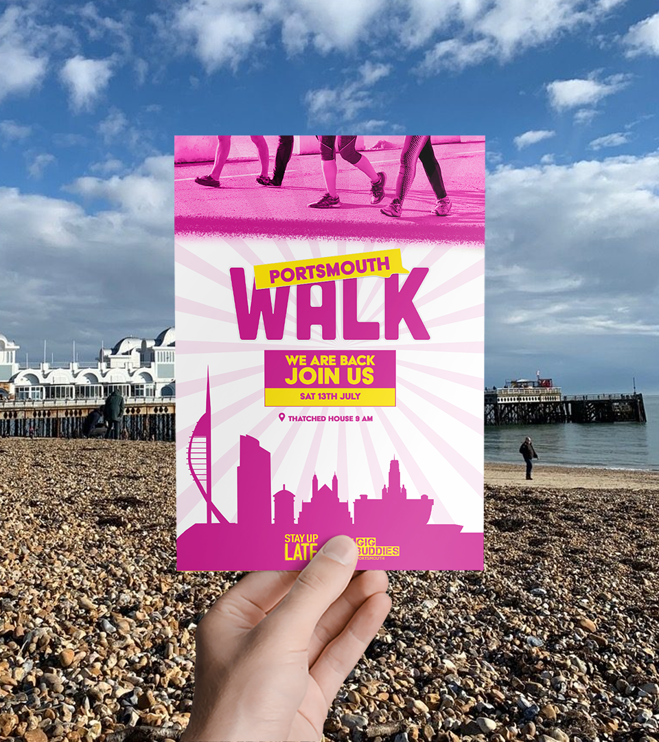
Print & merchandise
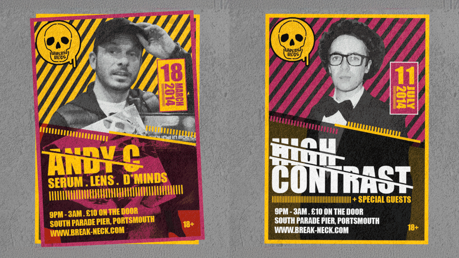
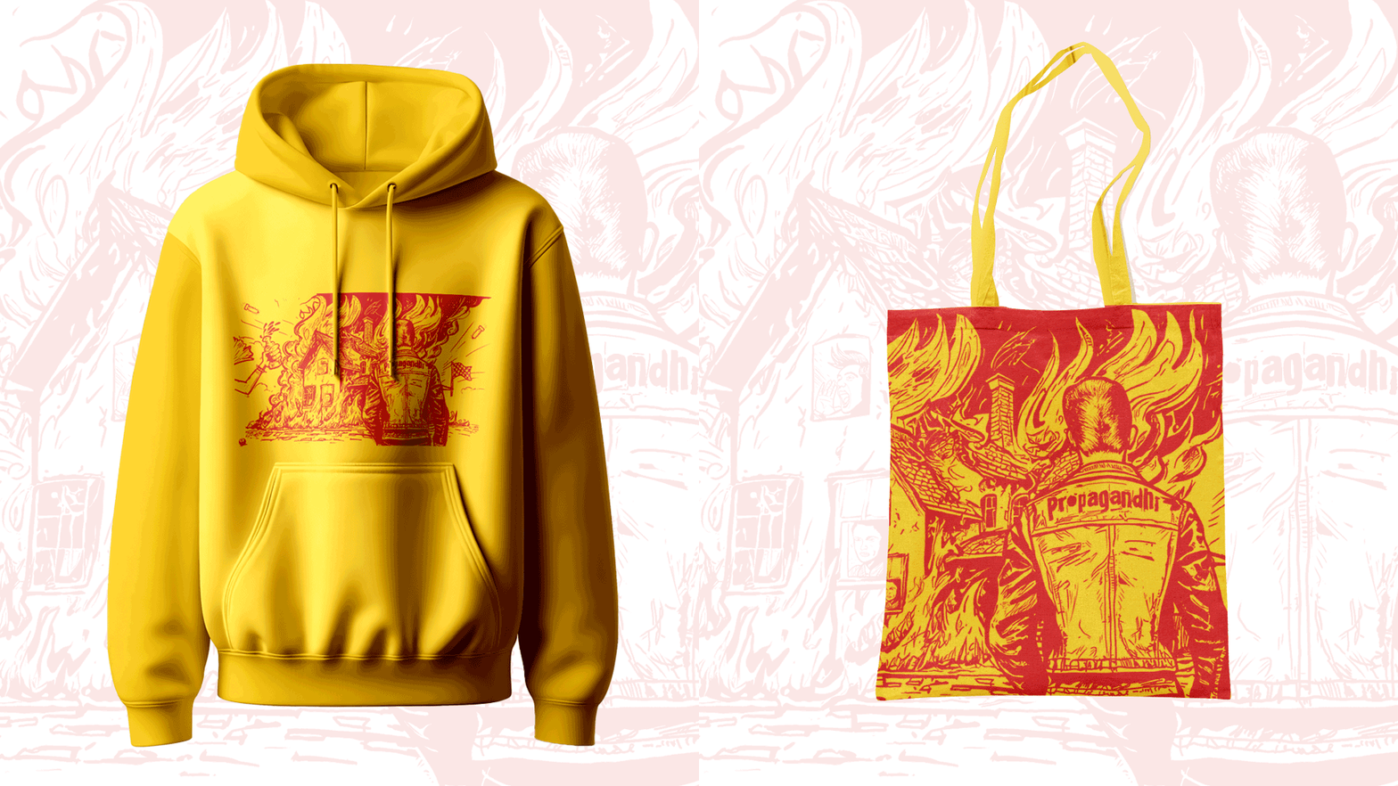
What you can expect
One point of contact. You work with me, the designer, from brief to final file — no account managers, no juniors.
Full ownership. Every logo, file and asset belongs to you, in every format you need.
Design with a purpose. Creative shaped by your marketing goals, not decoration for its own sake.
Honest advice and transparent pricing. A clear quote up front, and design that's production-ready and fit for purpose.
FAQs
Graphic design: your questions answered
How much does a logo cost in the UK?
A freelance logo typically costs £300–£1,500; a full identity with colours, type, guidelines and stationery £1,500–£5,000; agency branding £5,000–£25,000. I charge £350 a day, and a small business identity is typically three to five days — £1,050–£1,750 — with every file production-ready and yours to keep.
What does a graphic designer do?
A graphic designer creates the visual side of your business — logo, brand, print, social graphics, packaging, signage, exhibition stands — so it looks professional, consistent and unmistakably yours. A good one designs with a purpose, so every piece helps you get noticed, remembered and chosen. In my case, that means design led by marketing, not decoration.
What makes a good logo for a small business?
A good logo is simple, memorable and works everywhere — from a phone screen to the side of a van. It suits your business, stands out from your competitors and still looks right in ten years. Most importantly, it's built on a real understanding of who you are and who you're for, not a nice shape and a trendy font.
Is graphic design part of marketing?
Yes — the two are inseparable. Good design communicates the right message to the right people and moves them to act. That's why I treat every design job as a marketing problem first: work out what it needs to achieve, then design to that. It's the difference between a pretty logo and one that wins business.
Do I need a graphic designer or can I use Canva?
For a social post, an internal document or a simple flyer, Canva is fine and I'll happily say so. You need a designer when you're rebranding, printing in quantity, putting anything on a vehicle or building, selling something considered, or when competitors look markedly better and you're losing on first impression.
What are brand guidelines and do I need them?
Brand guidelines are the written rules for your identity: approved logo versions, clear space and minimum sizes, colours with exact values, typefaces, and which file is for what. They let you brief a printer or a freelancer without the designer in the room and keep everything looking like the same business. For any business with more than one person producing material, yes.
Do you do print design and exhibition stands as well as digital?
Yes — brochures, flyers, posters, packaging, signage, stationery, exhibition stands and vehicle wraps, all print-ready and production-managed. I've built full brand identities including exhibition and UAV wraps used across the UK, US and Norway. Print is where DIY design most often fails, usually after the print bill.
Where can I find a graphic designer in Portsmouth?
Here. I'm based in Portsmouth and work with businesses across Hampshire and the South Coast, with sixteen years and hundreds of projects behind me. Working with a local designer means you can sit down together to get things right, and your design is handled personally rather than through an agency queue.
Let's make something that works
Book a free, no-obligation design review. In thirty minutes, I'll look at what you've got, understand what you want it to do, and tell you honestly where better design would win you more business.
Related reading
 What does a graphic designer actually do — and when does a small business need one?What a graphic designer does day to day, what it costs, when a small business genuinely needs one, and when Canva will do the job perfectly well.Read the article →
 How much should a website cost? Real numbers, and what moves themWhat a small business website actually costs in 2026 — real price bands, what pushes the number up, and how to tell a £2,000 site from a £12,000 one.Read the article →
 How to write a marketing plan a small business will actually use (one page, four questions)A one-page marketing plan for small businesses — four questions, a channel choice, a budget and a way to tell whether it's working. No 40-page deck.Read the article →