
Logo and campaign design for a record store
BrandingGraphic DesignIllustrationMarketingPrintSocial Media
As music consumption shifted to streaming, buying a physical record stopped being the convenient option and became the deliberate one — which changes what the shop’s brand has to do.
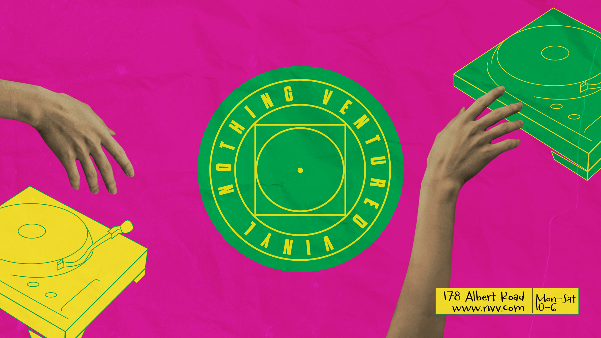
In late 2023 I shaped the identity for NVV, an independent record store on Albert Road in Southsea looking to carve out its own presence in a market with no shortage of competition. The work ran from the logo through to a full campaign across billboards, editorial and digital, plus the brand guidelines that let the shop keep producing its own artwork afterwards.
What the record shop brief actually needed
Independent record shops don’t compete on price or convenience, so the identity has to carry the part streaming can’t: the feeling that buying a record is worth the trip. The logo was drawn to sit on a shopfront, a bag, a stamp and a sleeve without losing its character at any of those sizes, and every campaign asset was built from the same marks so the shop could keep producing its own artwork once I handed over.
That’s how most of my graphic design work runs — an identity plus the system to use it, rather than a logo handed over with no instructions. If you’re weighing up what a new identity should cost and cover, the guide to what a graphic designer actually does sets out the whole scope.
A logo built on a grid, not on instinct
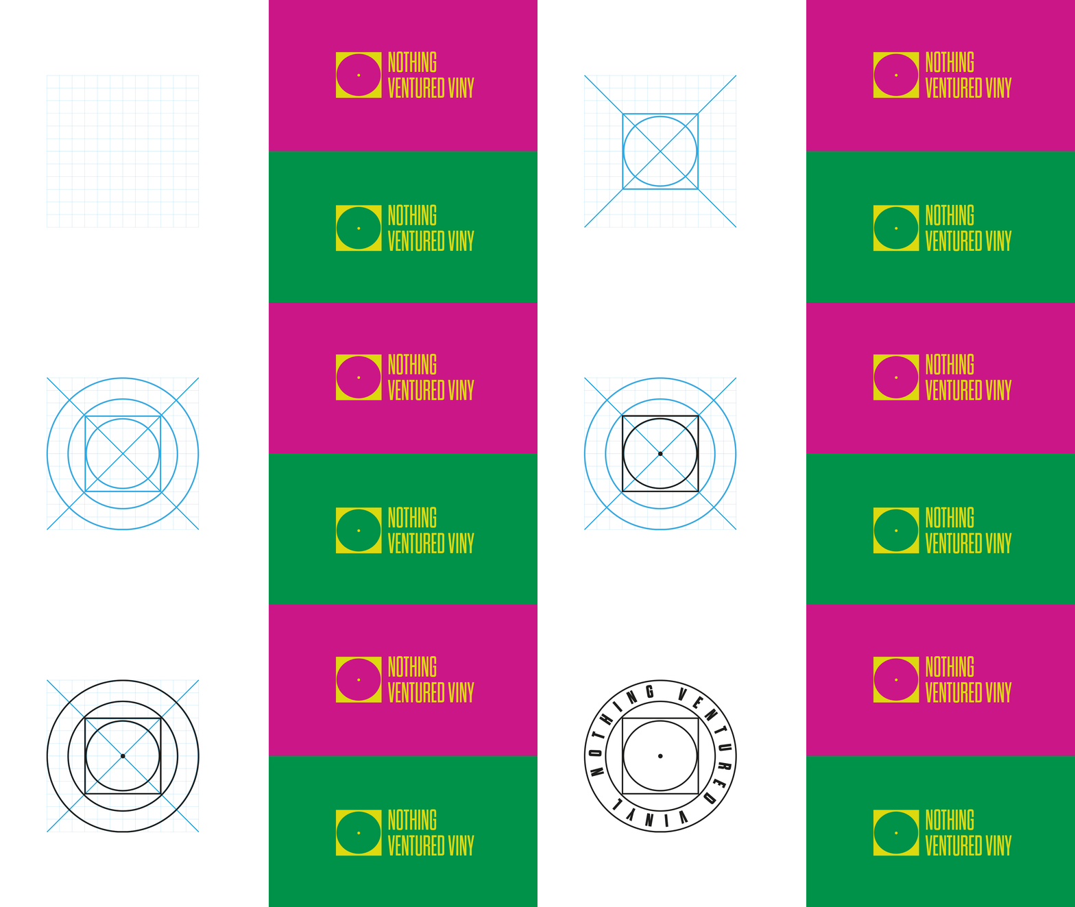
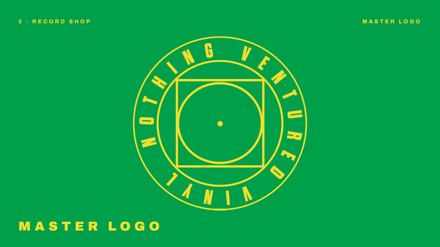
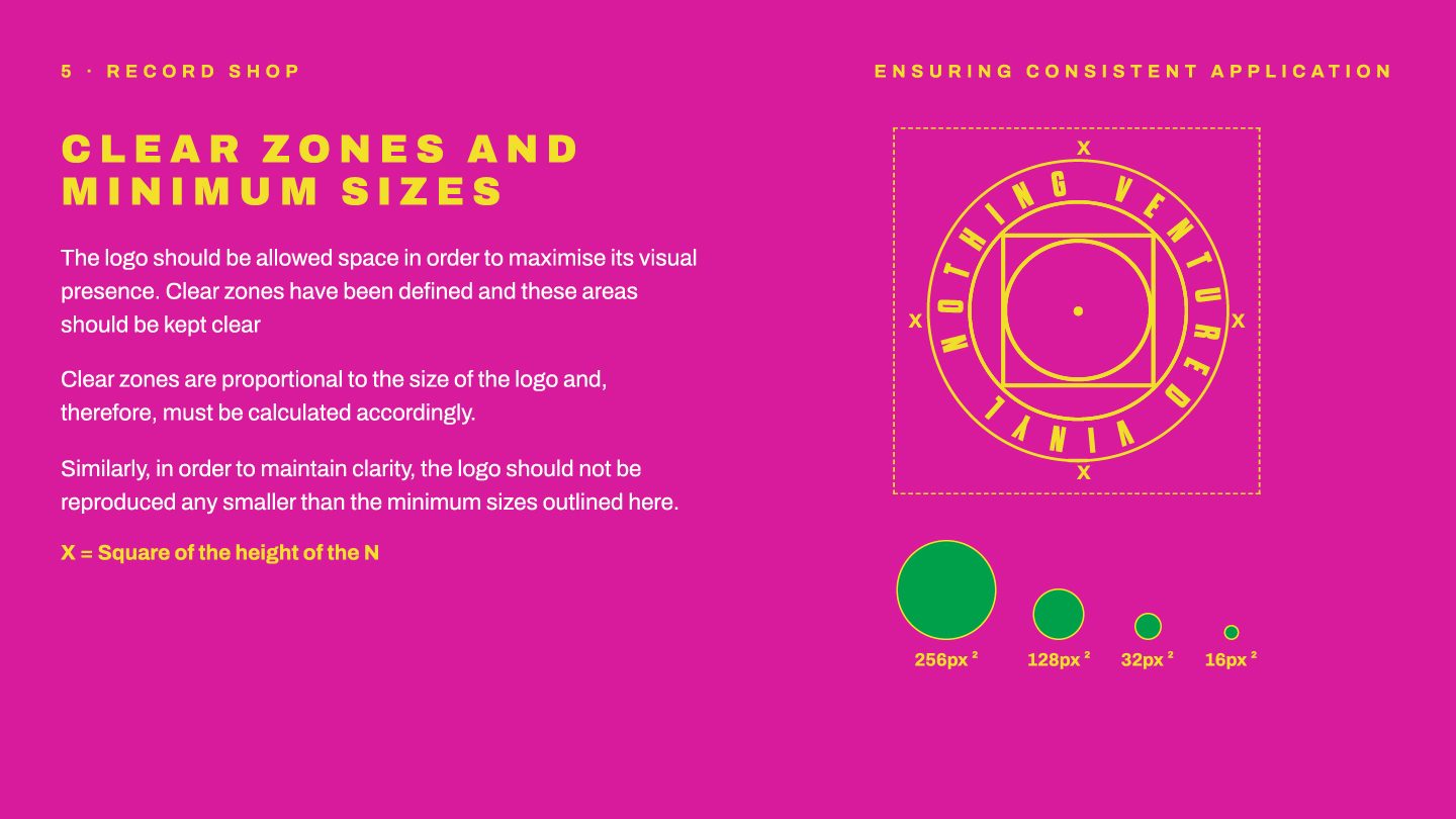
The mark was constructed on a geometric grid: every curve, line and piece of negative space aligned to an underlying structure. That’s what gives a logo mathematical symmetry, visual balance and the ability to scale without falling apart — a mark drawn this way holds up at 256 pixels on a phone and at four metres on a shopfront, because the proportions are fixed rather than eyeballed.
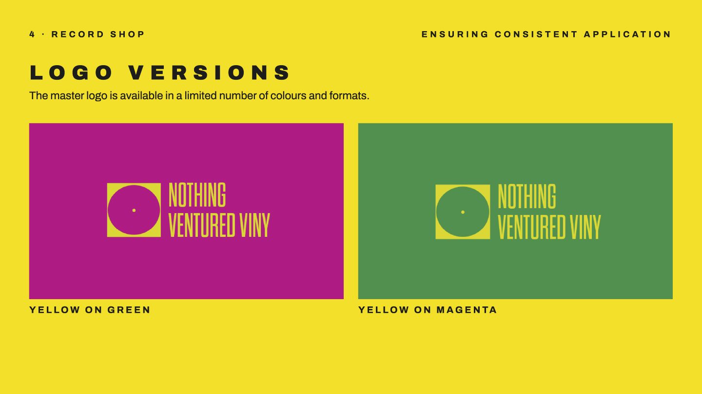
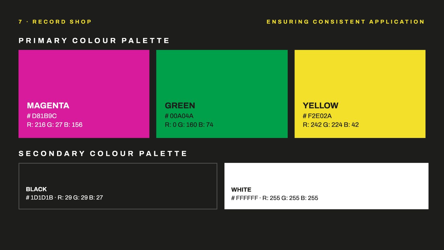
It’s presented in two colourways, and that’s deliberate. In a saturated market, bold colour and simple imagery are what get a shop noticed from across the street — and having two sanctioned versions rather than one means the identity still reads correctly whether it lands on a magenta poster, a green tote or a white sleeve.
The brand guidelines: the part that makes it last
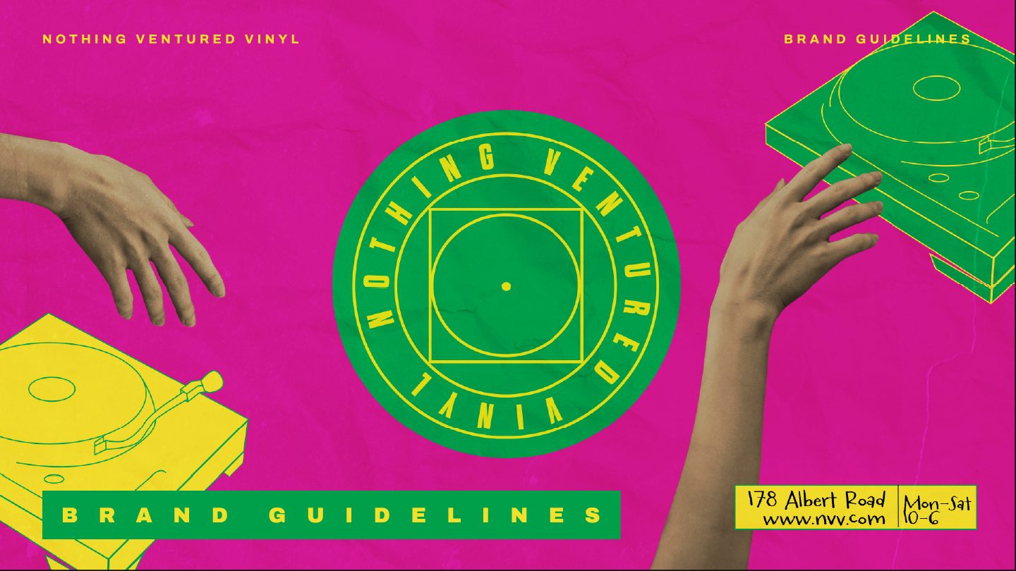
A logo is an asset. Brand guidelines are the instructions that stop it being misused — and they’re the difference between an identity that still looks like itself in three years and one that quietly drifts into something else.
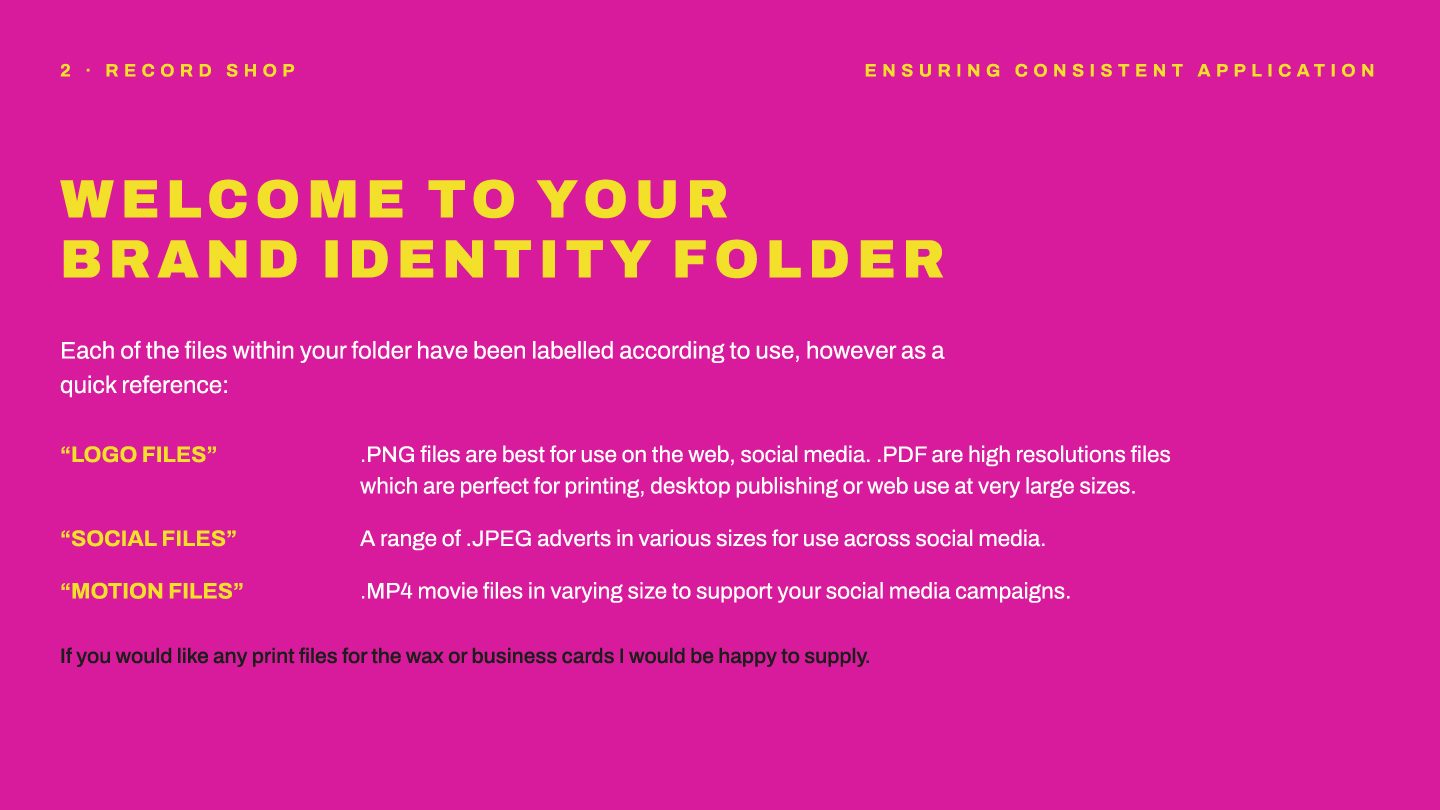
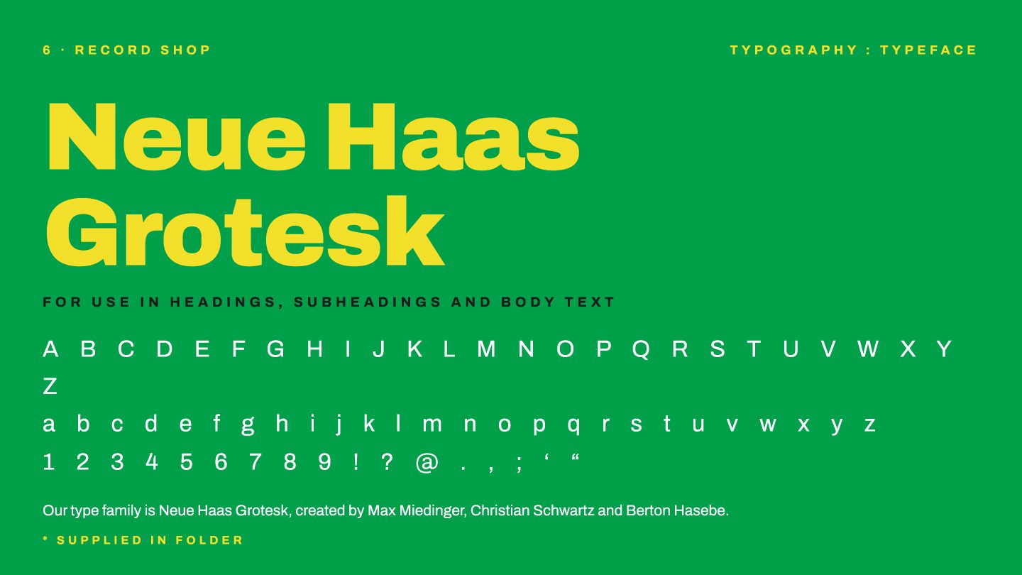
This document sets out the master logo and its approved versions, the clear zones and minimum sizes, the typeface — Neue Haas Grotesk, for headings and body alike — and the exact colour values: magenta #D81B9C, green #00A04A and yellow #F2E02A, with black and white as secondary. It also explains which file is for what: PNG for web and social, PDF for print and large format, JPEG adverts sized for each platform, MP4 for motion.
That matters commercially, not just aesthetically. Once the rules are written down, the shop can brief a printer, a sign-writer or a freelancer without me in the room, and everything that comes back still looks like the same business. It removes the bottleneck of having to ask the designer, and it means consistency survives staff changes, new suppliers and the inevitable rush job. For a small business, a set of guidelines is what turns a logo into a brand people actually recognise.
Print advertising, drawn by hand
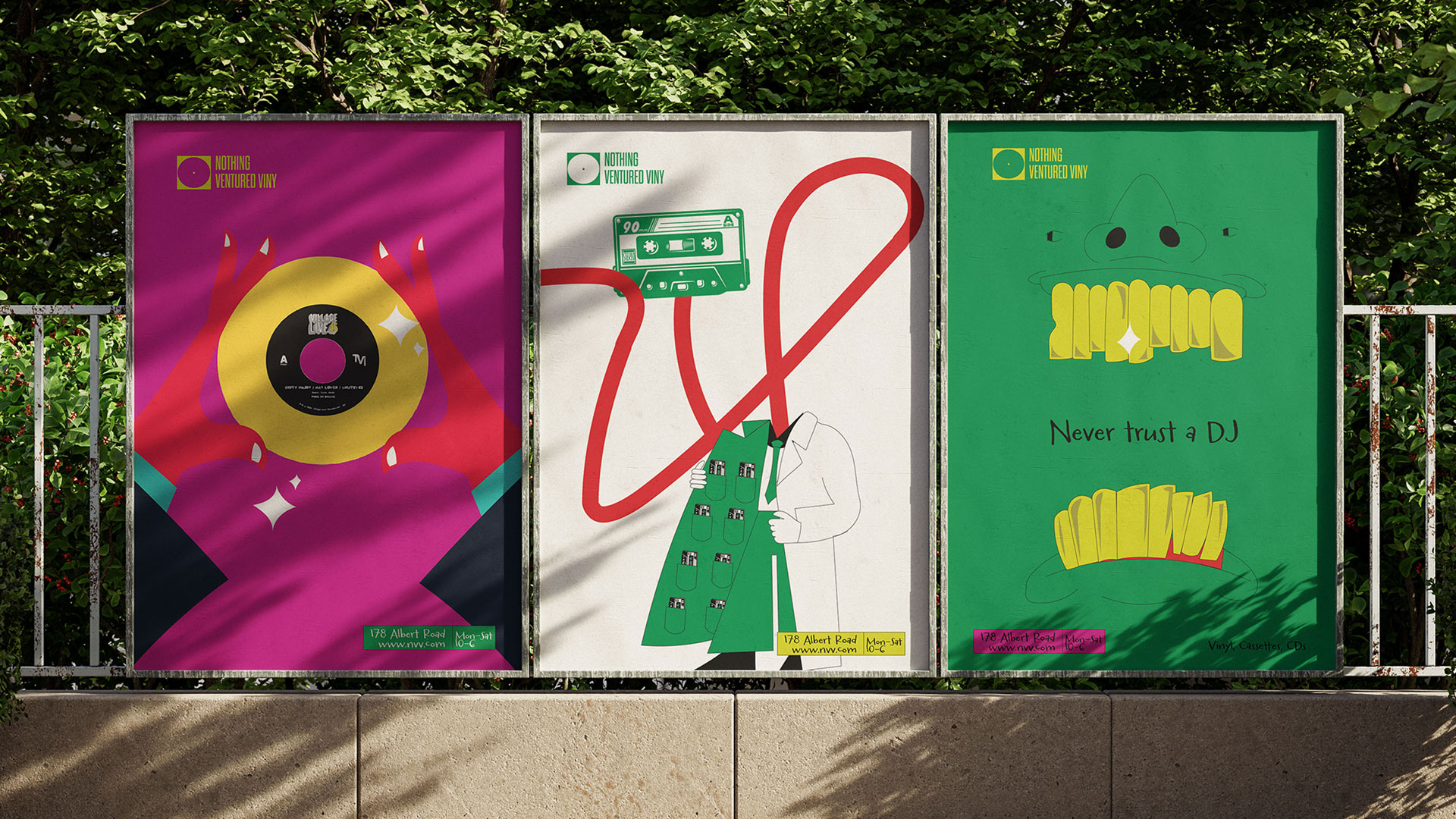
The billboard and poster campaign ran across Hampshire, and every illustration in it was drawn by hand in Procreate before being taken into Illustrator and rebuilt as vectors. Doing it that way keeps the warmth of a hand-drawn line — the thing that makes a record shop feel like a record shop — while making the artwork resolution-independent, so the same file works on a poster, a fence wrap or a six-sheet without a single pixel of quality lost.
Social content built from the same system
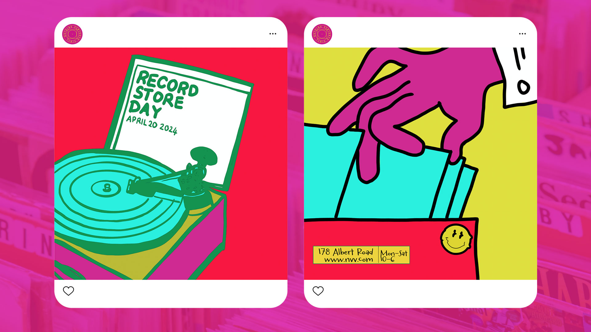
The social designs pull directly from the campaign palette and illustration set, so the grid reads as one brand rather than a run of unrelated posts. That’s the practical payoff of building a system first: the shop isn’t starting from a blank canvas every time it wants to post, it’s assembling from parts that already work together — which is exactly why the content output went up rather than the workload.
Sticker pack and animated advert
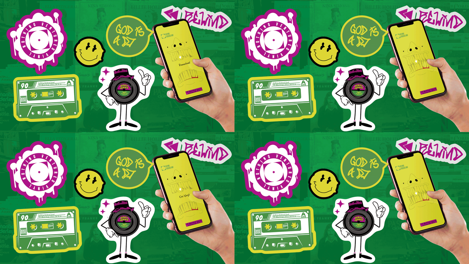
Stickers do something a poster can’t: customers put them on laptops, guitar cases and record crates, and the brand travels for free. The pack was designed from the same illustrated elements, alongside an animated advert built for social — motion being the one format that still earns attention in a feed people are scrolling past.
What it did
A cohesive brand and a system to run it has let NVV build and distribute content far faster, grow its online following by 2,000, double in-house sales and quadruple online sales. People recognise the brand now — which, for a shop trading on being worth the trip, is the whole job.