
Hot Sauce marketing campaign
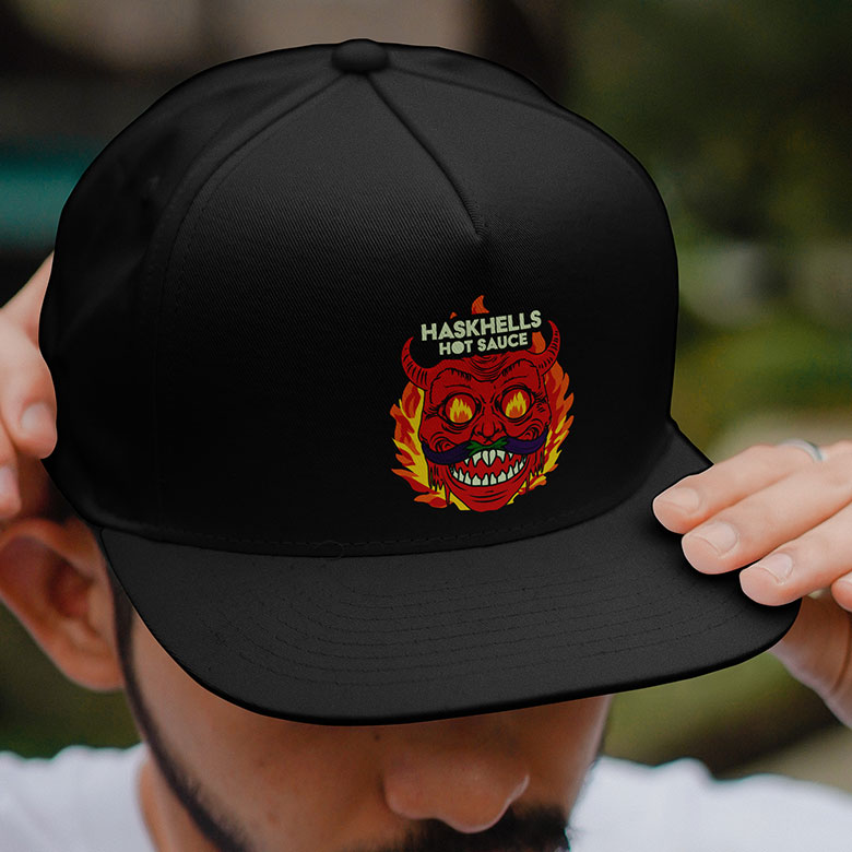
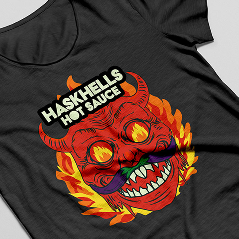
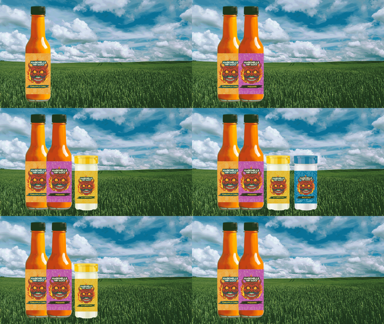
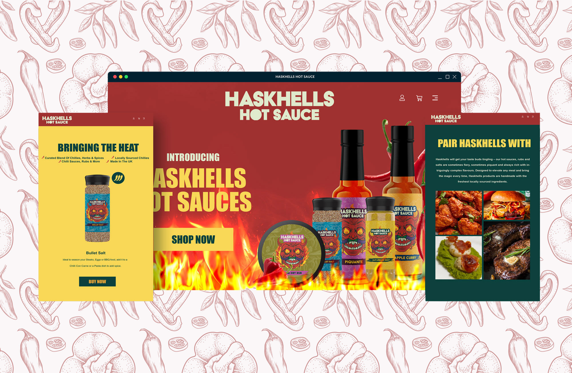
I developed a cohesive branding aesthetic by illustrating a series of assets and designing new product labels. This visual identity was seamlessly extended to the company’s e-commerce website and marketing materials. The design system was built with scalability in mind, allowing for easy integration of future product expansions.
Branding that has to work on a shelf
Packaging is the only marketing that meets the customer at the moment of decision, so it has one job before any other: be found. The illustrated assets and product labels were built around a strong block of colour and a single recognisable character, so the range reads as one family from across an aisle and each variant is still separable close up. The same illustrations then carried into the campaign, which is what makes a small brand look bigger than it is.
Brand, illustration, packaging and campaign from one person is the usual shape of my graphic design work, and it is why the pieces match. Where a launch also needs a shop or a landing page behind it, that comes from the same plan — see web design.