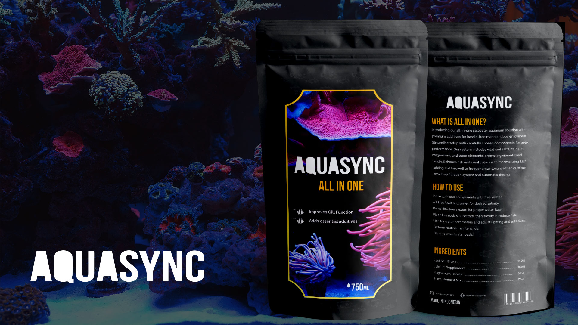
Fish Food Brand — Logo & Packaging
Logo and shelf-ready packaging. Strong visual on the front, clear information hierarchy. The two things packaging at point of sale needs to do.
Packaging that does its job at point of sale
Shelf packaging gets roughly three seconds. The front of pack was designed around a single strong visual so the product is findable at a distance, and the back around a clear information hierarchy so the buyer who has picked it up gets the answer they came for without hunting. The logo was drawn to hold up printed small and in limited colours, which is what real packaging production tends to demand.
Packaging, brand and the print-ready artwork all come from the same place in my graphic design work, so nothing gets lost between the design and the printer. Packaging also has to be produced, not just designed, so artwork was supplied to the printer’s specification with bleed, dielines and colour separations checked. That is the step where a lot of packaging projects quietly lose their quality.